The December update of ArcGIS API for JavaScript is here! The team has been hard at work on many improvements and new features, including animated streamlines, realistic weather in 3D scenes, better cartography, key updates to GeoJSON, and a lot more. Here’s a high-level look at some of the new capabilities that we’re excited about.
Visualize your raster data with animated streamlines
The new AnimatedFlowRenderer (beta) visualizes flow direction and magnitude information for meteorology and oceanography raster data.
In the following example, we are visualizing a hosted imagery tile layer containing wind magnitude and direction data (NLDAS 2011 wind data from NASA). The speed of line animations corresponds to the underlying concept of speed magnitude, and the continuous nature of the visualization makes it easier to spot patterns in the data. We first introduced this visualization technique as a custom WebGL implementation, but with this release, it is built into the API and is easily applied as the renderer for your imagery layers. It also works well with layer effects and blending, as shown in the below animation and this sample: AnimatedFlowRenderer with effects and blending.

We will continue to enhance the animated flow renderer in subsequent releases, for example, support for visual variables to drive aspects such as line opacity and color, and integration with the time slider.
Improved performance and stability
As part of our ongoing efforts to improve performance, we reduced memory usage up to 50% for applications with feature layers using simple polygons and simple polygon outlines by streamlining how vertex data is encoded. This will help increase stability on resource-constrained devices such as phones and tablets.
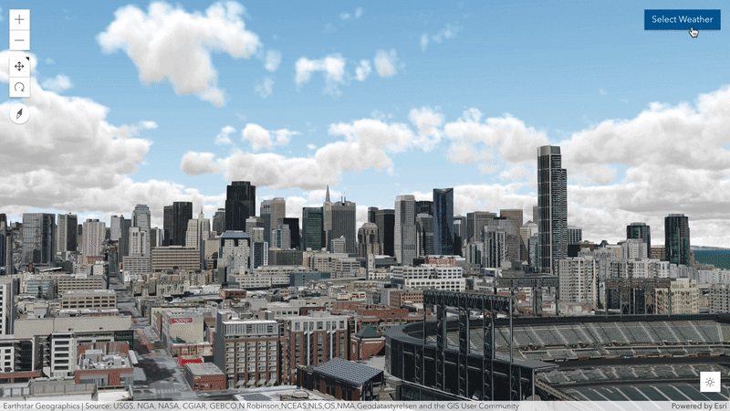
Control the weather in your scenes
Make your scenes look more realistic by configuring weather conditions from sunny to cloudy and even foggy. You can adjust cloud cover, fog strength, and the time-of-day to add realistic weather at ground level. Check out clouds at night! This release also includes improvements to atmosphere, providing more realistic lighting particularly around sunrise and sunset.
Line patterns (3D)
Use patterns in lines or polygon outlines to symbolize additional information, for example, to differentiate between planned and existing features. A new class LineStylePattern3D supports a variety of styles, on par with existing 2D capabilities. Patterns can be driven by attribute values, combined with visual variables, and displayed draped on the ground or elevated.

Voxel layers (beta)
Build web apps that visualize your multidimensional spatial and temporal information as a 3D volume via the new voxel layer. For example, they are used to visualize atmospheric or oceanic data, a geological underground model, or space-time cubes as voxel layers. You can use them to explore spatial relationships with other content by visualizing them together. For example, you might want to view an underground geological model with boreholes or construction that is planned in an area. Upcoming releases will add support for explorative tools and popups to inspect individual voxels. In the near future, voxel layers will also be supported in web scenes. Please share any feedback you have in this Esri Community post.

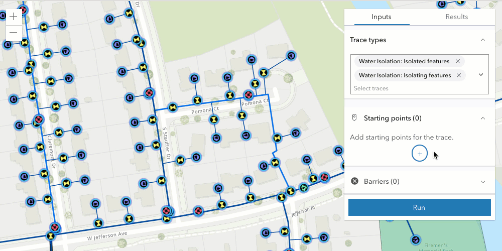
Utility network tracing widget
Utility network tracing is often used to help deliver resources to customers, track the health of a network, and identify deteriorating areas. In version 4.20, we introduced utility network tracing, which could be accessed programmatically via a trace method. With 4.22, the new utility network trace widget provides a user experience for running a trace. The widget allows users to set the starting point for the network trace, and barrier points are added to mark the locations for stopping the trace.
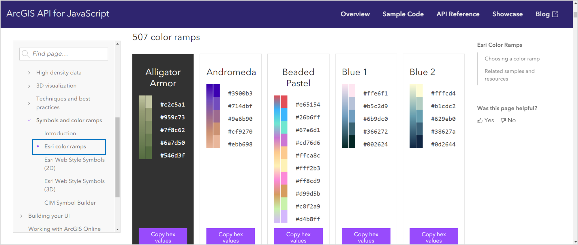
More color ramps
The ArcGIS API for JavaScript provides hundreds of color ramps that enable developers to improve the mapping experience in their apps. Numerous cartographers with decades of experience in color theory and knowledge of how perceptual differences between colors work created these color ramps. This release we expanded the selection to include 167 additional colorblind-friendly color ramps (you might even enjoy some of the names; Alligator Armor, Cigar Smoke, Esri Bananas, and Chocolate Mint).
These ramps include dozens of newly designed above-and-below ramps that emphasize middle values, in addition to the values above and below the critical middle value. Traditionally, above and below color ramps use neutral hues that blend in with the basemap, making it difficult to see those points. There are many scenarios where that is desirable (e.g. where the important values are further from the center). However, we added ramps that make the middle values more obvious so users can easily see the locations of all data points, especially when middle values are important to highlight in addition to the extremes.
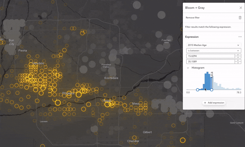
Best practices for visualizing high-density data
We added new guide topics that discuss tips for displaying High density data in a meaningful way. This chapter demonstrates seven effective techniques for visualizing data with overlapping features, including clustering, heatmap, opacity, bloom, aggregation, thinning, and visible scale range. A summary of these concepts is described in the Techniques for visualizing high density data on the web blog.
Improved polyline labels
We improved the polyline labeling experience by giving developers more control and configuration options:
Parallel labels: Previously, the API only allowed for a “curved” labelPosition, which meant each of the label characters followed the curve of the polyline. Version 4.22 introduces an additional “parallel” option that ensures the label characters will always be straight, and the orientation of the label will be based on the polyline curve angle.
Repeat frequency: Control over the distance between repeated labels on a polyline.
Overrun labels: Configure whether labels are to overrun the geometry feature being labeled, e.g. after the end of a polyline segment.
See the images below to compare how the more flexible polyline labeling works:

GeoJSON, CSV, and GeoRSS – key updates
Refresh data: With this release, you can configure CSV, GeoRSS, and GeoJSON layers to refresh; this means that new data is fetched after those layers are initialized and loaded in the map. This can be done once (explicitly) or periodically by setting a timeframe for the refresh to occur (in minutes).
Custom parameters: We also added support for custom parameters on both CSV and GeoJSON layers. This property is used to set additional query parameters when the layer is initialized or refreshed. Check out this sample to see refresh and custom parameters in action on the GeoJSON layer.
GeoJSON in webmaps and webscenes: Author and save webmaps and webscenes that include GeoJSON layers. This is done using the ArcGIS Online authoring experience in Map Viewer and the Scene Viewer, or programmatically in your app.
Smarter, faster, & flexible popups
A variety of improvements have been made to the popup:
Only show popups for visible features: As of version 4.22, the popup only displays for features visible in the map. If there is a filter applied, only the features that pass the filter will return a popup. We will continue to improve popup behaviors in coming releases.
Optimized performance: The popup only makes one query to the server for missing attributes if not all required attributes are available on the client. No server requests are made if all attributes are available on the client.
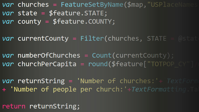
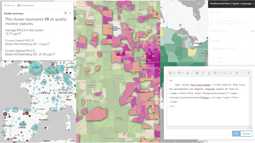
Use Arcade to create popup content elements: Rather than using JavaScript, you can use Arcade to define dynamic popup content including rich text with HTML, tables, and charts. The power of this approach is that you can save conditional popup elements in a webmap and load it in any ArcGIS app, providing a consistent user experience for apps loading the same webmap. This feature is especially useful in layers representing aggregated data. Check out these examples of how to use Arcade to create popup content elements.
Create popup charts from Arcade expressions
Popup charts for point clusters
Automatic preview of attachments: If the feature layer’s capabilities include resizing attachments (supportsResizeAttachments), the content will display in preview mode.
Configure feature-specific effects in Map Viewer
Map effects apply graphics software-like effects to features in a map layer. Feature-specific effects take the next step by allowing map authors to emphasize some features in a layer with one kind of effect and de-emphasize the rest using a different effect. While this capability has been available programmatically via the API for quite a while, it is new to the ArcGIS Online Map Viewer (part of the December 2021 update). It offers a great experience for playing around with the effects and feature filtering using map authoring tools, which can be saved to your web map and easily loaded into your web app. Persisting featureEffects in layers – either in Map Viewer or programmatically in your JS app – is supported for the following layer types: CSV, GeoJSON, feature layers, OGC feature layers and WFS layers. See the release notes for implementation details.
MapView.hitTest improved in graphics layers
MapView.hittest now returns all features that intersect the specified screen coordinates from a graphics layer. Previously, it only returned the topmost feature from a graphics layer. We will implement this behavior for other layers in upcoming releases.
Search widget
When the scale of the view is less than or equal to 1:300,000, the Search widget prioritizes candidates based on their distance from the center of the view. You can choose to override this default behavior by using the localSearchDisabled property.
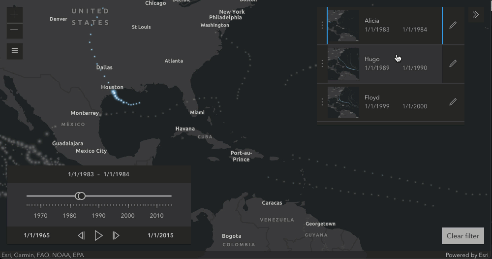
Time-enabled bookmarks
The Bookmarks widget was updated to support a new dimension – time. Clicking on a time-enabled bookmark affects not only the viewpoint but also the timeframe of the map by setting the view’s time extent. In the below example, hurricanes and storms are visualized using a time slider from 1965 to 2015. The bookmarks are used to jump between different time periods when hurricanes occurred. Since the time slider is setting the View.timeExtent, any new bookmarks created by the user will automatically be time-enabled.
Discover more
There’s quite a bit more to this release, including time support for imagery tile layers and WCS layers, easier graphic selection when sketching, and better display of overlapping polygon features. For the full scoop on the release, check out the release notes and take the new capabilities for a test drive using the latest samples.
3.x news: End of support for Internet Explorer 11
Support for Internet Explorer 11 and Microsoft Edge Legacy was deprecated at 3.35 and is discontinued as of version 3.39.


Article Discussion: